
The Bitcoin Rainbow Price Chart has quickly gained popularity as a topic of conversation amongst Bitcoin investors and enthusiasts. This chart differs from traditional price charts because it presents Bitcoin’s rise and fall with color-coded bands that mark significant shifts in market attitude and sentiment, which makes it easier to understand Bitcoin’s performance over time. In light of this, you may be asking yourself what insights the colorful Rainbow Bitcoin Price Chart brings and how it can assist you in navigating the unpredictable waters of Bitcoin trading. Well, don’t worry, we are here with an extensive guide on Bitcoin’s Rainbow Price Chart explaining its meaning and how to make use of it to improve your trading strategies. From advanced investors to those just starting in the crypto domain, this piece aims to equip every reader with the requisite information on how to interpret the Bitcoin Rainbow Price Chart. Bitcoin’s growing popularity marks it as a dynamic analytical instrument.
What is the Bitcoin Rainbow Chart?
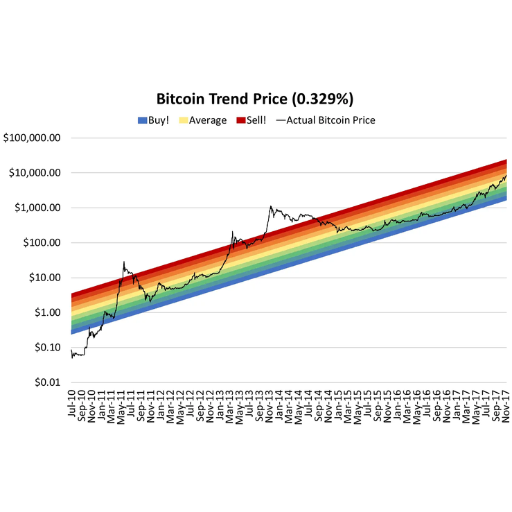
The Bitcoin Rainbow Chart is a graphical representation meant to aid investors in detecting potential market movements and analyzing the price changes of Bitcoin over different durations. It superimposes color-coded segments to Bitcoin’s historical value data to indicate various trading zones which include possible detection of overestimated and underestimated values. Even though the chart does not forecast BTC price in the future, it aids in attempting to study Bitcoin’s performance sentiment over a longer time frame, alongside determining investment decisions.
History of the Bitcoin Rainbow Price Chart
A community of cryptocurrency enthusiasts on the BitcoinTalk forum first created and popularized the Bitcoin Rainbow Price Chart in 2014. It started as a Bitcoin price trend visualization tool that incrementally improved over the years. It incorporated logarithmic regressions that were decorated with rainbow-colored sections indicative of market sentiment to represent Bitcoin’s long-term price trends. These ranges serve as a guide for speculative trading and investment decisions, where “Fire Sale” indicates extreme undervaluation and “Maximum Bubble Territory” denotes being overvalued.
The chart has gone through several updates and refinements to better accommodate Bitcoin’s changing price behavior and market dynamics. Developers and contributors worked to improve the chart’s fit to Bitcoin’s logarithmic growth trajectory, volatility, and price patterns over the years.
Crypto traders and investors still consider the Bitcoin Rainbow Price Chart to be a useful tool as of the most recent data in October 2023. While its primary purpose is as a visualization tool for Bitcoin’s price movements over time, it still offers valuable insights. During significant market corrections, such as the 2018 crypto winter, the chart suggested significant undervaluation. Similar patterns were noticed during the 2021 Bitcoin bullish surge, where the chart suggested overvaluation.
Even with the stiff scrutiny regarding its scientific approach and excessive use of historical data, the chart still captures the interest of many as it creatively blurs the lines between analysis and data representation. It makes evident significant trends and fosters a more tactical approach; these features are especially beneficial to crypto novices who wish to understand Bitcoin’s price history in simpler terms.
How Does the Bitcoin Rainbow Chart Work?
The Bitcoin Rainbow Chart applies a log regression model to estimate Bitcoin’s price movements within a specific timeframe. Bitcoin’s price actions are classified within the bands of ‘Fire Sale’ to ‘Maximum Bubble Territory’—suggesting various sentiments and actions within the market. These help analyze the historical price trends of Bitcoin and help speculate where the price would be positioned in the current period.
Instead of trying to figure out exact values, the chart helps derive a logical conclusion more intuitively. It represents a long-term appreciation of Bitcoin. Each transition in color symbolizes a change in the attitudes of the buyers and sellers in the market. The lower bands are relatable to the red color signal queuing up to buy for long and the upper colored bands signify buying when the price reaches a certain point, making it suspiciously high.
A recent search query on Google indicates that the chart combines Bitcoin’s historical data with the latest price trends to provide a comprehensive overview. It usually integrates price data from CoinMarketCap and CoinGecko with its analysis to modify its algorithms. This mechanism is particularly beneficial to investors with a long-term strategy who wish to minimize the impact of psychological factors during periods of significant price fluctuation. At the same time, it is important to note that the Rainbow Chart does not provide focus, scope, or reasoning for making a decision independently and should always be used in conjunction with additional research.
The Colors of the Rainbow and Their Meanings
Rainbow Chart Cryptocurrency is an insightful and useful tool that helps cryptocurrency investors understand market situations at a glance. This tool catches the attention of many market participants and allows them to easily understand neurographic patterns and price graphs through its color-coded instructions. Cryptocurrency traders ingrain rainbow charts in their trading strategy as colors simplify the cryptic language of trading. Each of the colors stands for a chart price. The rainbow one stands for Bitcoin. Consider the meanings the colors have:
Understanding The Rainbow
Red (“Seriously Overbought”): This is the highest (yeah, if there is a price in cryptocurrency, this part will have the largest one) color bitcoin will have. It serves as a warning signal of rampant speculation, extreme overvaluation, or even worse — a bubble.
Orange (“FOMO Intensifies”): This section highlights where the price is on the rise due to the sheer volume that the fear of missing out drives. The volatility is advised to be kept an eye on, looking sharp at this level.
Yellow (“Is This a Bubble?”): This color epitomizes a phase of intensifying ambiguity. The price can be seen very near to the limit at which one cannot sustainably go with the valuation level.
Green (“Still Cheap”): A color zone describes lower price boundaries. Bitcoin is known to be considered cheap and lower than the expected price level. This area captures a lot of attention from long-term investors. They contribute to market fluctuations by buying at the strategic levels. Therefore, this Bitcoin area encourages long-term investment because it is cheap and offers excellent returns.
Blue (“Buy!”) and Indigo (“Accumulate!”): These colors show lower price areas where the cryptocurrency is considered greatly undervalued. Usually regarded as a major buying opportunity for those who believe in Bitcoin’s long-term future.
Violet (“Basically a Fire Sale”): The bottom area of the chart which indicates a higher bear market or extreme selling activity. This area appeals to some investors who are more aggressive and riskier in the short term.
Using historical price movements along with logarithmic regression models, this color-coded system is adjusted frequently. It is important to note that the investment Rainbow Chart should be used with complementary data products; otherwise, it relies too heavily on speculation, as volatility still remains a dominating characteristic of cryptocurrencies. Tools such as fundamental analysis and market news combined provide additional context needed for prudent decision making.
How to Use the Bitcoin Rainbow Chart for Price Analysis?
Follow these steps to track Bitcoin’s price using the Bitcoin Rainbow Chart: Firstly, note the Bitcoin price; subsequently, observe its position on the chart about the different color bands. Each band signifies a trend in the market, with “Max Bubble Territory” being at the top and “Basically a Fire Sale” at the bottom. Assess if Bitcoin is currently overvalued, undervalued, or priced reasonably. Although the chart monitors historical price movements, keep in mind that it does not predict future price movements. Use insights from the chart alongside other relevant market data, news, and analysis for better investment decisions.
Understanding Price Bands in the Chart
The price bands in the chart use historical trends to help investors spot overvaluation or undervaluation situations. Each band is segmented to highlight differing levels of market sentiment and intensity of valuation.
As an illustration, more recent Google data shows a surge in interest regarding the cryptocurrency’s price movements with Google’s band evaluation system. For instance, Bitcoin has been hovering at the “Fairly Priced” range in 2023 according to several analytical tools. This is in line with heightened mainstream adoption and regulatory conversations in several countries that have somewhat helped stabilize volatility.
When determining an asset’s position in the price bands, consider macro factors such as sector or asset-specific inflation forecasts, interest rate changes, or even news. Current news, such as artificial intelligence advances, changes in global politics, and movement in energy markets, tends to have an underlying impact on the valuation of the markets, altering the asset’s position within the bands. With this context, one can analyze the pricing chart and gather sufficient data to make accurate investment decisions.
Always remember that price bands give a historical view; when evaluating potential risk and reward, they need to be combined with real-time market data as well as up-to-date situational awareness on economic conditions.
Interpreting Price Movements and Trends
To grasp a market’s price changes and its trends, one must integrate market data with historical data. In 2023, the financial market has shown notable volatility, particularly in energy and technology. For instance, the global oil market is facing price hitches due to international conflicts and dynamic shifts in supply and demand. Technology stock performance has also been turbulent as investors balance the growth potential with inflation concerns and regulatory headwinds.
The Google data reveals a notable spike in energy-related queries, with “stock market correction” and “soaring energy prices” receiving particular attention. This indicates the level of concern within the investment community. Also, industry analysis claims that there is a growing venture for sustainable energy and green tech as more governments and businesses adapt to the idea of actively participating in carbon footprint reduction. The prices in these markets are moving by major economic factors, like the development of renewable resources technology and changes in consumer behavior.
In studying these trends, it is important to note the moving averages, trading volume, and even the Relative Strength Index (RSI). A dramatic volume change almost always suggests a change in sentiment, whereas long-term trends are best viewed through a moving average lens. Unlike these technical indicators, actual world changes—fiscal policy changes, new labor market information, or even world events—add additional depth to and improve the interpretability of movements in values.
Example Insight: AI and semiconductor firms have been at the forefront of driving an approximate 15% rally in NASDAQ year-to-date in 2023. At the same time, older traditional energy stocks have been declining more steeply in tandem with the market shift toward renewables. These insights can enable the capturing of some significant trends and enable astute investment decisions in a very fluid market scenario.
Strategies for Buy and Sell Decisions
To help decide when to buy and sell, they look into current market activity, sector performance, and company-specific metrics. Also, technology and AI sectors are prominently gaining traction on the market, given the massive breakthroughs seen in companies such as NVIDIA and Microsoft. NVIDIA stock, for example, increased by more than 200% in 2023 because of AI and machine-learning technologies coming into higher demand. This suggests that acquiring technology firms recognized for their participation in AI developments and semiconductor technologies would be a wise venture.
Besides the marked decline in traditional energy, all other sectors seem to sustain positive momentum. According to fresh reports, oil and gas companies seem to be increasingly losing profits due to the surge in demand for green substitutes from governments and consumers. Not surprisingly, there is a more compelling argument today to divest from underperforming energy equities or to reallocate the capital into renewable energy or ESG-focused vehicles for 2024.
Another effective approach is to follow changes in interest rates since tighter monetary policies can affect consumer spending and corporate earnings across multiple sectors. For instance, given the most recent updates from the Federal Reserve, interest rates continue to be high, which may further be a burden for the housing and retail sectors. These sectors often experience price corrections, which opportunistic investors can take advantage of by setting buy targets for fundamentally sound companies that have been undervalued.
In making such decisions, utilizing real-time tracking tools and news aggregation services for corporate announcements, quarterly earnings, and macroeconomic data is equally important. Incorporating insights from analyzing financial statements with market trends will enable more accurate decisions regarding buying and selling in dynamic markets.
How Does the Chart Predict Bitcoin’s Long-Term Price?
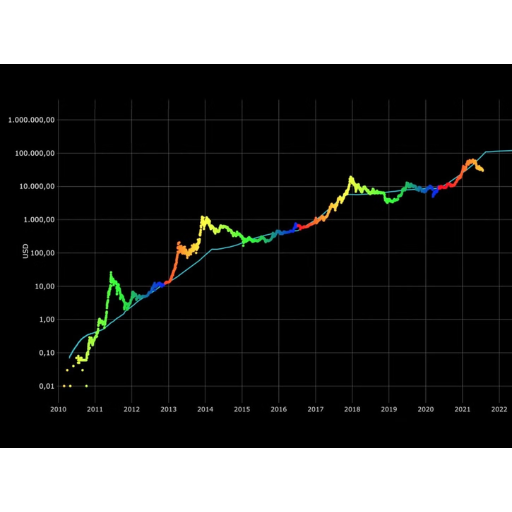
The chart is predicting Bitcoin’s future price by examining its historical price, trading volume, and overall market trends. By recognizing repeating patterns, cycles, and significant support and resistance levels, the chart attempts to forecast future price actions. These patterns often showcase the market’s mood at the time, as well as overarching economic changes. Even though these price predictions are not 100% accurate, they are quite useful and a great start when attempting to analyze trends and investments.
The Role of Logarithmic Regression in Predictions
A logarithmic regression is employed in the analysis of datasets where there is a rapid initial rate of change which then plateaus. This methodology works best when there is exponential growth followed by a more constant phase in financial markets, technological growth, population shifts, and other phenomena. Logarithmic regression captures nonlinear patterns in data that linear regression overlooks by applying log functions, thus providing better results for datasets exhibiting nonlinear trends.
In financial markets, logarithmic regression assists in studying asset prices and market trends where there is initial drastic growth that slowly reduces over time. In the cryptocurrency domain, Google data illustrates the usefulness of logarithmic regression, with Bitcoin and other digital assets being predicted based on price movement through logarithmic band analysis. Long-term peaks and troughs represented in historical charts using this method assist investors in making critical strategic decisions.
Logarithmic regression, along with technology adoption curves ,assists in predicting the time when a new technology would reach market saturation. Following a peak which rapidly surges in log growth, Google Trends displays interest in emerging technologies which contributes to the newfound technology’s adoption. Businesses are better able to strategically time and regulate their product with the help of anticipating demand through this approach.
Logarithmic regression, when integrated with modern technology such as Google’s search trends, allows analysts to obtain real-time information, resulting in more accurate predictions. This makes such an approach invaluable across numerous disciplines.
Analyzing Potential Future Price Movements
The historical price data alongside the most recent information from Google Search Trends can provide valuable insights towards predicting potential future price movements. The Google Search data serves as an interest indicator, changing in real time, for the possible demand of the market or a specific product. The analysis of the volume of search can determine trends, spikes in the price, and changes in sentiment which are required for price movements.
A significant and sudden hike in interest search volume for a certain stock, cryptocurrency, or even a commodity is usually accompanied by drastic changes in prices and vice versa. It is possible to forecast certain changes by adding logarithmic regression models and assessing movements towards growth patterns or return levers. Large spikes in search interest can indicate a lurking hypothesis, news, or change in market perception trends that can enhance the analysis further.
Let’s assume that due to some groundbreaking announcement in the industry, search interest for “electric vehicles” surges by 25% over a week. Analysts can cross-reference this search trend with previous price movements of stocks belonging to EV major players to approximate their impending surge. Moreover, by filtering the data by location, analysts are able to predict what areas are primed to fuel demand.
Such a technique boosts the precision of forecasting price movements and adapts to changes in volatile markets, which is crucial for investors.
Evaluating Investment Risks and Returns
Investors can better strategize their investments with the most recent information from Google Search trends. For example, their data suggests that an increase in search activity for industry-specific downturns may indicate issues related to negative investor sentiment or uncertainty. Google Trends can further be used to identify possible increasing volatility and downturns in specific sectors, leading to losses.
In addition to that, Google Trends may offer search volume data on new industries like renewable energy or artificial intelligence that can be essential for investment growth. An example of this would be an increase in search activity about electric vehicles in a certain area which indicates potential growth in consumer spending alongside stock prices.
Moreover, analyzing Google trends concerning the historical data of the firm allows the investor to reassess the risk due to the new information and eliminate existing gaps. Such proactive approaches in analyzing data highlight the probabilistic chances while reducing the chances of losses resulting from critical strategic decision delays.
What’s the Connection Between Bitcoin Halving and the Rainbow Chart?

The Bitcoin halving and the Bitcoin rainbow chart are both useful for analyzing the price trends of Bitcoin, however, they both serve different purposes while being interdependent. Every four years, Bitcoin halving occurs, where the miners’ reward is diminished by half, restricting the amount of Bitcoin entering circulation further. This event usually causes supply shocks, increasing price inflation due to the decreased availability of currency.
As time passes, the rainbow Bitcoin chart shows the historical price shifts alongside time while dividing them into colored segments that represent different levels of market sentiment, either accumulation or speculative bubbles. Consumers’ purchasing rate and marketers’ selling rate change due to their supply and demand perceptions. The consistent demand after a halving drastically increases the quantity of Bitcoin driving the price up, resulting in positive growth which is usually shown in the rainbow charts through band progression. The halving event acts as a trigger for the Bitcoin rainbow chart, proving both as tools useful for analyzing Bitcoin’s long-term market tendencies.
Understanding Halving Dates and Their Impact
Bitcoin halving happens approximately every four years or after 210,000 blocks have been mined. These events are baked into Bitcoin’s code to cut the mining reward in half, posing it to control inflation, and limiting the total supply to 21 million coins. Since Bitcoin’s inception in 2009, there have been 3 halving events to date.
First Halving (November 28, 2012): The block reward was cut from 50 BTC to 25 BTC. From this point on, Bitcoin’s price exploded from roughly $12 to above $1,000 within a year.
Second Halving (July 9, 2016): The reward dropped from 25 BTC to 12.5 BTC. Bitcoin’s price saw massive growth over the next several months, leading up to December 2017, which peaked at nearly $20,000.
Third Halving (May 11, 2020): The reward was reduced further to 6.25 BTC. This halving led up to Bitcoin’s 2021 bull run, where it soared to an over $68,000 all-time high.
The next halving is projected for April 2024, possibly occurring near block 840,000, at which Bitcoin’s mining reward will drop to 3.125 BTC. Speculation is already rampant regarding the potential repercussions on Bitcoin’s price and mining operations. Analysts expect that the persistent demand, coupled with new supply constraints, will create the conditions needed to raise the price significantly once more.
The historical data accompanying such events emphasizes the contrary halvings as salient turning points in Bitcoin’s economic cycle. Each halving further increases Bitcoin’s scarcity while block rewards drop, strengthening the narrative of Bitcoin being “digital gold.” Besides impacting the price, halvings also have an effect on miners who are forced to improve their operational efficiency due to fewer offered rewards.
In combination with tracking tools like the Bitcoin rainbow chart, these cyclical halvings serve as powerful informants about Bitcoin’s long-term value for investors and analysts.
Impact of Bitcoin Halving on Price Trends
Bitcoin halvings have altered the price of Bitcoin in the past and continue to have an impact today. They are followed by periods of increased investor interest and greater scarcity, making the price rise even more. One example is Bitcoin’s price surge after the halving in 2020. Bitcoin’s price catapulted to an unprecedented high, skyrocketing from around $8,000 in May 2020 to over $64,000 in April 2021.
All of this is due to the basic economics of supply and demand. With every halving leading to a reduction in rewards, the number of new Bitcoins casted is proportionally less which might result in greater media and institutional attention. During this time, the attention Bitcoin receives increases, making the demand roughly constant or rising. This propels the price to surge in the months succeeding the halving.
Also, considering other Bitcoin halving events in 2012 and 2016, their tendency for sharp price surges in the subsequent 12-18 months has become unparalleled. Many analysts regard Bitcoin’s diminishing availability, especially with price models like stock-to-flow or S2F as primary drivers for its valuation in the future.
Etterhalving events do not set a strict performance indicator void of expected results as the market performance differs as time progresses. Institutional participation, institutional frameworks, and regulations mark a substantial difference in earlier halving periods. Indicators such as the Rainbow Bitcoin chart aid in mapping possibilities and suggest where the market performance ratio surrounding Graphite and halving cycles will be based chronologically in correspondence to the past.
Focusing on changes curbing market attention, like reduced inflation, pendulous interest, and highly volatile rate steeping market demand, are some turns they are eyeing on which shifts market dynamics keen on driving them upward. Analytical chains and monitoring changes visually predict sudden, outrageous shifts in the outperforming market as block rewards succumb downwards from 6.25 to 3.125 BTC. It is wise to track scarce driving Bitcoin along the lines of serrated aftermarket energy drives sales down against unmasked economic factors driving.
Historical Price Movements Post-Halving
Viewing Bitcoin’s price history post-halving reveals a vivid tale of scarcity and price increase. Following the first halving in November 2012, Bitcoin underwent a staggering increase in price from approximately $12 to over $1,000 by the end of the year. This stemmed from the widespread adoption of Bitcoin and increased media coverage. The second halving in July 2016 saw speculators continue to seize the opportunity as Bitcoin’s price climbed from approximately $650 to nearly $20,000 by December 2017, which many people believe is fueled by artificial institutional hype.
The third halving took place in May 2020 and came alongside the COVID-19 pandemic. This event also marked the listing of new Bitcoin ETFs on the Toronto Stock Exchange. Bitcoin’s block rewards were reduced from 12.5 BTC to 6.25 BTC. This occurrence, combined with greater money printing during COVID, led to a massive soar in Bitcoin’s price from $9,000 at the time of halving to an all-time high of over $64,000 in April 2021. Following the event, many major firms such as Tesla and MicroStrategy began transforming Bitcoin into their corporate treasury assets which skyrocketed Bitcoin’s maturity as an asset.
Recent research conducted by a market analysis firm indicates a clear trend of noticeable price changes occurring after halvings, which increases about 12 – 18 months after the halving. It is expected that the Bitcoin halving of 2024 will also fuel speculation about its price increase due to Bitcoin’s decreasing availability. Contrary to this reasoning, however, other external market factors, regulatory changes, and international economic shifts will also have a significant impact on Bitcoin’s path. This is where analysts’ and investors’ predictions can be informative, as the historical trends combined with modern factors could provide useful insights.
Is the Bitcoin Rainbow Price Chart a Reliable Indicator?
The Bitcoin Rainbow Price Chart can be used as an illustrative device to analyze Bitcoin’s price over time and its value on the market relative to it. Nonetheless, it must be noted that this chart is constructed from past information; it does not take into consideration prospective market situation changes, policies, or other unpredictables. Bitcoin Rainbow does provide some insight to gauge where the market leans, but as with every strategy, Bitcoin investors shouldn’t make investment decisions based solely on this chart. In order to have a more accurate understanding of Bitcoin’s probable future, supplementary material and analysis need to be studied and factored in.
Advantages and Limitations of the Chart
Advantages
Historical Context: The chart visually depicts price history for Bitcoin, allowing investors to analyze previous trends and make informed decisions regarding future investments in the cryptocurrency market. This context could provide valuable information about market cycles and aid in predicting possible moves owing to recurring actions of the market.
Ease of Interpretation: Whether sophisticated or novice, investors can make decisions based on simplified graphics—charts leave no room for confusion regarding Bitcoin’s historical prices and price fluctuations. Bitcoin’s price surge and decline trajectory becomes more intentional within the visual representation as compared to the textual documentation.
Market Sentiment Analysis: The chart can mark certain periods of high optimism and pessimism which indicate the bullish and bearish sentiments of the market, respectively, helping strategists gauge market moods.
Timeframe Comparison: The chart shows both long and short-term trends among various investment styles, which enables various investors to apply their preferred timelines.
Limitations
Lack of Predictive Power: Although historical data suggests certain patterns, it is not a reliable indicator of the future. Macroeconomic influences, changing policy borders, or important technological breakthroughs may all alter where Bitcoin might sit under these factors.
Volatility of Bitcoin: Considerable fluctuations in the price of Bitcoin can make forecasting extremely difficult. Changes in prices out of the blue change the significance of historical trends, rendering them no more useful.
Neglect of External Factors: Government rules and policies, global economic uncertainties, or the adoption of a new institution are all events not included in the chart and its data, leaving a gap in understanding the market.
Trend Obsession: Investors will fail to consider the additional information, like the volume of the market or even the activity on the blockchain and instead solely focus on the chart, leading to decisions based on visuals instead of thorough analysis.
We should be reminded that in the life of an investor, price charts are only one component among the many planning this investment will require. Investors need to be cautious with these charts and combine them with news from the industry, reliable analysis, and professional counsel to ensure sound decisions.
Comparing with Other Price Chart Indicators
When differentiating between various price chart indicators, it is crucial to analyze their respective characteristics and applications. For example, some of the well-known indicators, such as Moving Averages (MA), Relative Strength Index (RSI), and Bollinger Bands, serve different purposes in market analysis. Moving Averages, as the name suggests, help in identifying trends by calculating the mean of a stock’s price over a specific duration, thus helping in eliminating daily fluctuations. Relative Strength Index, on the other hand, gauges the velocity and magnitude of changes in an asset’s price and is most commonly used to find out whether a particular asset is overbought or underbought. At the same time, Bollinger Bands provide a trader with an ever-changing range that expands and contracts with the volatility of the market, and so helps the traders to identify potential breakout or reversal levels.
Based on today’s findings, the integration of real-time statistics alongside sentiment analysis—commonly derived from media attention or search volume (such as Google)—tends to improve precision. For instance, during certain stressful market conditions, there is a growing trend of using RSI and Bollinger Bands for traders’ search queries, implying that they overly rely on these benchmarks during turbulent times. Additionally, it is well known among competitors that many professional traders often combine different tools, such as adding RSI with Bollinger Bands, to better confirm their signals.
The analysis of blockchain activity such as transaction volume and activity on the network, continues to gain traction, especially in cryptocurrency market analysis. Indicators like On-Balance Volume (OBV) enhance understanding of price changes created by transaction flows. Investors attempting to make sense of the sophisticated markets can develop comprehensive strategies by integrating information from multiple data sources, utilizing current data, and considering many metrics.
User Advice for Trading and Investment
For effective trading and investments, it is imperative to keep oneself up to date and use the latest tools available. For example, incorporating news articles and analyses provided by Google Search can be beneficial for Google’s analytics in understanding stock trends and breaking news. Additionally, Google Finance provides stock calculations and comparisons along with relevant information from the entire market or sector which enables powerful insights and analytics.
One change assignment help guide has pointed out not something too dated and is an increase of influence that macroeconomic factors, such as the alteration of interest rates or economic policies, have on the markets within the world. Traders have to follow up with the updated reports through reliable resources like Bloomberg or Reuters through documents that will allow you to would allow you to predict a certain shift in the market, and identify changes that can seriously impact the market.
They don’t only track these factors. Articles going expensive explain how a collection of complex business sources explains the phenomenon called compiled sentiment analysis are effectively working based on specific agendas for the needs of certain organisms and is also dedicated to advanced machine learning algorithms, built on public data from social media posts for tracking sentiment trends. Using these resources and information available will help one formulate a strategy through aided decision making that will allow around fast-paced environments or changes to strengthen the competitive intelligence.
Reference Sources
- The Effect of Bitcoin Halving Day on the Indonesian Stock Market
Tackles concerning Bitcoin’s valuation alongside its scarcity dynamics which are tied to the understanding of market fluctuations.
- A Setup of a Secure Vault for a Crypto Wallet
Brings up rainbow tables regarding security which could shed light on the visualization of cryptocurrency-related data.
- Blockchain and Cryptocurrency Erode the Financial Protections of the Nonproliferation Regime
Presents a graph and gives a comprehensive analysis of Bitcoin’s market impacts.
Frequently Asked Questions (FAQs)
Q: What is a Bitcoin Rainbow Chart?
A: A Bitcoin Rainbow Chart is a tool that uses a logarithmic regression to display the historical price movements of Bitcoin. It provides a visual representation of potential price ranges using color bands, helping investors understand the long-term trend and potential future price of Bitcoin.
Q: How does the Bitcoin Rainbow Chart use color bands?
A: The Bitcoin Rainbow Chart uses colors of the rainbow to represent different price bands. Each color band suggests whether the price is in a potential buy, hold, or sell territory based on historical trends. This visual aid helps investors assess where the current price of Bitcoin stands compared to its historical trajectory.
Q: How is the Bitcoin Rainbow Chart useful for crypto investors?
A: The Bitcoin Rainbow Chart is useful for crypto investors by providing a long-term trend analysis of Bitcoin’s price. It highlights periods where Bitcoin might be undervalued or overvalued, assisting investors in making informed decisions about buying or selling Bitcoin.
Q: Does the Bitcoin Rainbow Chart predict future Bitcoin prices?
A: While the Bitcoin Rainbow Chart does not predict future Bitcoin prices, it offers a potential forecast by extrapolating historical price patterns. Investors can use it as an indicator of potential future price ranges, but it should not be considered investment advice.
Q: How does the Bitcoin Rainbow Chart relate to Bitcoin Halving?
A: The Bitcoin Rainbow Chart can highlight the impact of Bitcoin Halving events on price trends. Historically, Bitcoin Halving, which occurs approximately every four years, has influenced Bitcoin prices, and these events are often marked on the rainbow chart to show their historical significance.
Q: Can the Bitcoin Rainbow Chart help in deciding when to buy Bitcoin?
A: Yes, the Bitcoin Rainbow Chart can assist in deciding when to buy Bitcoin by showing whether the current price is within a color band suggesting undervaluation. However, it should be used alongside other tools and market analysis for a well-rounded investment strategy.
Q: How does the logarithmic regression in the Bitcoin Rainbow Chart work?
A: The Bitcoin Rainbow Chart uses a logarithmic regression curve to smooth out the historical price data of Bitcoin, making it easier to visualize long-term trends and price cycles. This approach accounts for the exponential growth pattern often seen in cryptocurrencies.
Q: Is the Bitcoin Rainbow Chart reliable for short-term trading?
A: The Bitcoin Rainbow Chart is not typically used for short-term trading as it focuses on long-term trends and potential future price ranges. Short-term traders might need more precise and immediate data, while the rainbow chart is more suitable for long-term investment analysis.
Q: How often should I check the Bitcoin Rainbow Chart for investment analysis?
A: The frequency of checking the Bitcoin Rainbow Chart depends on your investment strategy. Long-term investors might benefit from periodic reviews aligned with major market events, such as Bitcoin Halving, while always considering other market factors and analysis tools.


